Short answer
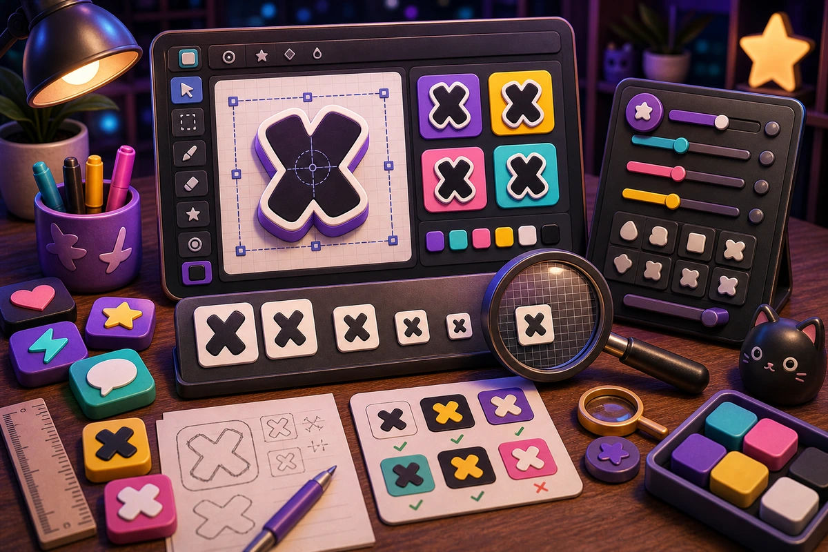
A text emoji readability workflow at 32 px should be planned around repeatable chat moments, not decorative filler. Start with OK reaction., NO reaction., LIVE reaction., SHIP reaction., then add niche reactions only after the first set is getting used. Use one or two short words at most, large letterforms, and a simple shape behind the text.
Who this is for
This guide is for Discord admins, Slack teams, streamers, and designers making short text-based reactions.
The traffic and revenue value comes from readers who already know the community or workflow they are serving. Make text-based custom emoji readable by choosing short words, bold fonts, strong contrast, and minimal motion. A clear pack plan gives them a reason to upload a source image, generate stronger keepers, and export for Discord and Slack.
Recommended starter set
OK reaction.
NO reaction.
LIVE reaction.
SHIP reaction.
BRB reaction.
LFG reaction.
Workflow
Step 1
Choose the real moments
Start by deciding whether the text still adds value after it becomes tiny. A smaller set tied to repeated behavior will outperform a large set of pretty reactions that nobody remembers to use.
Step 2
Create a shared visual rule
Use one or two short words at most, large letterforms, and a simple shape behind the text. Keep one crop, outline weight, palette, and background approach so the pack feels intentional.
Step 3
Launch with usable names
If the text and the emoji name are identical, consider whether the visual needs a stronger shape or color cue. Upload a first set, announce the names, and watch what people actually use before expanding.
Quality checklist
- Choose reactions that map to real Discord and Slack moments.
- Keep the subject large enough to read at chat size.
- Use one naming convention across the whole pack.
- Export a static fallback for any important animated reaction.
- Preview at 32 px and stop adding detail as soon as readability drops.
Common mistakes
- Making the pack too broad before the first Discord and Slack upload.
- Letting tiny details carry the meaning.
- Using names only the creator understands.
- Skipping a final grid review before upload.
- Using long phrases.
- Choosing decorative fonts with thin strokes.
- Animating text so much that letters blur.
Next steps
FAQ
What should be in a text emoji readability workflow at 32 px?
Start with OK reaction., NO reaction., LIVE reaction., SHIP reaction.. Those cover the moments people are most likely to repeat. Add niche reactions only when the core set is already being used.
Should a text emoji readability workflow at 32 px use animation?
Use animation for simple pulsing alerts, not detailed text movement. Keep status, moderation, and text-heavy reactions static unless motion makes the meaning clearer.
How do I get people to use the pack?
If the text and the emoji name are identical, consider whether the visual needs a stronger shape or color cue. Announce the pack with the exact names, model the reactions in real conversations, and remove weak items after a usage review.
