Accessible emojis aren't just nice to have—they make your emotes actually usable for more people. Someone with photosensitivity shouldn't get a headache from your animated reaction. Someone who's colorblind shouldn't miss the meaning. Screen reader users should know what your emoji means. Here's how to design emojis that work for everyone.
Make them readable at small sizes
Emojis show up tiny. Discord reactions are roughly 24px. Slack shows them at 20-22px in messages. If your emoji has fine details that disappear at that size, people won't know what it is.
Test at actual size. Don't design at 500px and assume it'll work small. Zoom out to 24px in your editor and see if the emoji is still recognizable. If you have to explain what it is, simplify it. Bold shapes, thick lines, high contrast.
Avoid text unless it's huge. "OK" in giant letters might work. "Meeting in 5 minutes" will be illegible. If you need text, make it 2-3 characters maximum and use a super thick font. Better yet, use a symbol instead of text.
Use outlines. A 2-3 pixel outline (black or white depending on the emoji colors) makes your emoji visible on any background color. Without an outline, a yellow emoji disappears on light mode and a dark blue one vanishes on dark mode.
Don't rely on color alone
Colorblind users can't distinguish some colors. Red-green colorblindness affects about 8% of men and 0.5% of women. If your "yes" emoji is green and your "no" emoji is red, and they're otherwise identical, colorblind users can't tell them apart.
Add shape differences. Make your "yes" a checkmark and your "no" an X. Make your "warning" a triangle and your "error" a circle. Different shapes plus different colors means everyone can distinguish them.
Status indicators need more than color. If you're making emojis for "working on it" (yellow), "done" (green), and "blocked" (red), give them distinct symbols: hourglass for working, checkmark for done, stop sign for blocked. Color becomes a bonus cue, not the only cue.
Avoid seizure-triggering animations
Flashing is dangerous. Rapid flashing between colors (especially red) can trigger seizures in people with photosensitive epilepsy. This is serious—people can get hurt.
The 3-flash rule: Don't flash more than 3 times per second. If your emoji alternates between two states (on/off, light/dark), make sure each state holds for at least 0.33 seconds. Slower is safer.
Avoid strobing effects. Rapid color cycling, flickering, or high-contrast blinking are all risky. Smooth transitions are always safer than sudden changes. Gentle pulses, slow bounces, and smooth fades are fine.
Test the loop. Watch your animated emoji loop 10 times in a row. If it's annoying, headache-inducing, or eye-straining for you, it's probably worse for someone with photosensitivity. Slow it down or reduce the contrast.
Consider motion sensitivity
Some people get motion sick from animations. Vestibular disorders affect balance and spatial orientation. Zooming, spinning, or fast movement in animations can cause nausea or dizziness.
Keep motion gentle. A subtle bounce or slow rotation is usually fine. Rapid spinning, aggressive shaking, or zoom effects that pulse in and out are more likely to cause problems.
Consider offering static versions. For important emojis (like status indicators or frequently-used reactions), consider making both animated and static versions. Some servers disable all animated emojis for accessibility, so having static fallbacks ensures the emojis are still useful.
Use descriptive names
Screen readers read emoji names aloud. When someone using a screen reader encounters your emoji, they hear the filename or alt text. ":custom_emoji_47:" is useless. ":thumbs-up-sparkle:" tells them what it is.
Name emojis by their meaning, not appearance. ":red-circle:" doesn't help. ":error:" or ":stop:" tells people what it's for. ":person-waving:" is better than ":arm-up:".
Be consistent with naming. If you have a set of status emojis, name them consistently: ":status-available:", ":status-busy:", ":status-away:". The prefix helps with autocomplete and makes it clear they're related.
Avoid special characters and numbers in names. Use hyphens or underscores, not spaces. ":question-mark:" works better than ":question?" or ":q-mark:" for screen readers.
Test on light and dark themes
People use different theme modes. Your emoji needs to work on both light and dark backgrounds. What looks great on dark mode might be invisible on light mode.
Check contrast on both backgrounds. Light-colored emojis (white, yellow, light blue) can disappear on light backgrounds. Dark emojis (black, dark purple, dark green) disappear on dark backgrounds. Add an outline or adjust colors so they work everywhere.
Test actual platforms. Discord's dark theme, Discord's light theme, Slack's dark mode, Slack's light mode—they all have slightly different background colors. Your emoji should be visible on all of them.
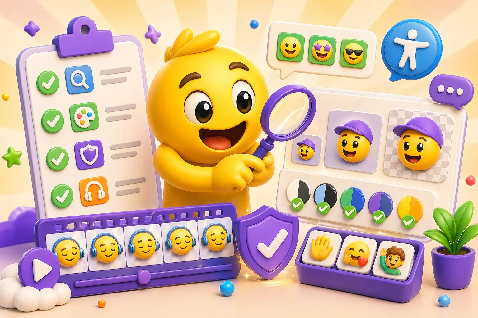
Accessibility checklist
- ✓ Emoji is recognizable at 24px size
- ✓ Uses bold shapes and thick lines
- ✓ Has an outline that works on light and dark backgrounds
- ✓ Doesn't rely only on color to convey meaning
- ✓ Animation doesn't flash more than 3 times per second
- ✓ Motion is smooth and gentle (no aggressive spinning/shaking)
- ✓ File name describes meaning, not just appearance
- ✓ Tested on both light and dark themes
- ✓ Text is either huge or removed entirely
- ✓ High contrast between emoji elements
Quick accessibility test: Show your emoji to someone at actual size without telling them what it is. If they can identify it in both light and dark mode, watch it loop 10 times without getting a headache, and the filename makes sense when read aloud, you're good. Make accessible emojis →
