You're finalizing your emoji design and face a fundamental choice: transparent background or solid color? The decision seems simple but affects how your emoji looks across platforms, themes, and devices. Transparent backgrounds adapt to any interface but require careful design. Solid backgrounds guarantee visibility but look dated on some platforms. Neither is universally better—the right choice depends on your design and where it'll be used.
How transparency actually works
PNG files support alpha channel transparency, meaning each pixel can be fully opaque, fully transparent, or anywhere in between. This allows smooth edges, anti-aliasing, and complex shapes without rectangular boxes around them. When you export a PNG with transparency, the background disappears and your emoji sits cleanly on whatever surface it's placed on.
GIF transparency is cruder—each pixel is either 100% transparent or 100% opaque, no in-between. This creates jagged edges unless your design has hard edges to begin with. For animated emojis that require GIF format, this limitation matters. You can fake smooth edges with careful color choices, but true anti-aliasing requires PNG.
Platforms render transparent emojis by compositing them over the interface background. Discord's dark gray, Slack's white, Twitch's dark purple—your emoji appears on top of these. This means light colors in your emoji might blend into Slack's light interface, while dark colors might vanish into Discord's dark theme. Your design needs to work on both extremes.
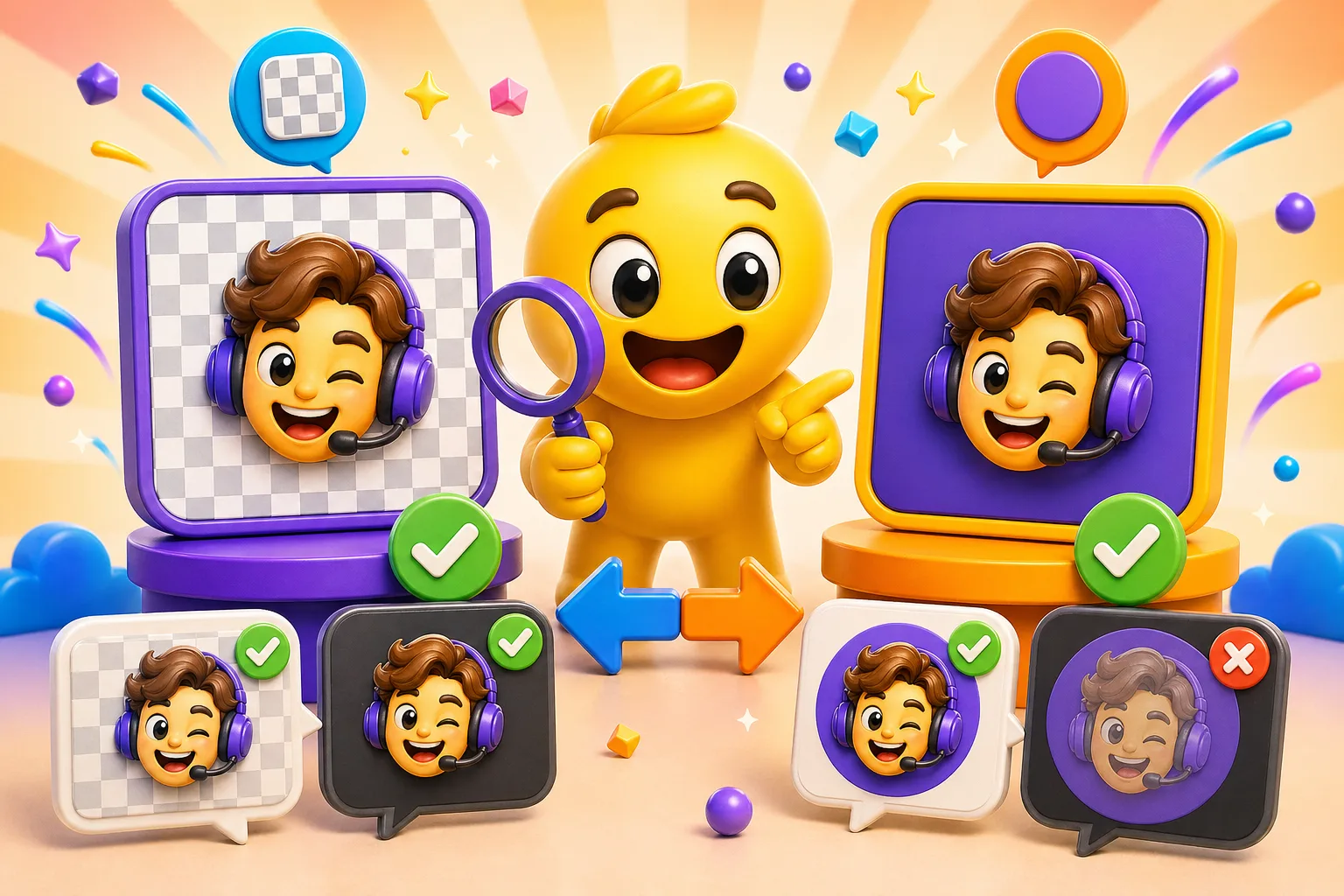
Why transparent backgrounds win for most use cases
Transparent emojis adapt to any theme automatically. Your Discord server members use dark mode. Your Slack workspace defaults to light mode. With transparent backgrounds, your emoji works on both without modification. This is the primary advantage—design once, deploy everywhere.
Modern emoji standards favor transparency. Look at Unicode emoji, Twitch emotes, or any professional emoji set—almost all use transparent backgrounds. Users expect emojis to integrate seamlessly into chat. A solid rectangle around your emoji immediately looks amateur compared to transparent alternatives.
Organic shapes require transparency to look natural. A circular emoji with transparent background shows just the circle. With a solid background, you see a circle inside a square, wasting visual space and drawing attention to the background instead of the subject. Complex shapes like stars, hearts, or custom silhouettes only work properly with transparency.
File size can be smaller with transparency. Solid backgrounds add pixels that need to be stored. Transparent pixels compress more efficiently in PNG format. This matters when you're working within Discord's 256KB or Slack's 128KB limits. Every byte saved on background is a byte available for your actual design.
The problems transparency creates
Light-colored designs vanish on light backgrounds. That pastel yellow smiley face you designed? Invisible on Slack's white interface. Your light blue icon? Can't see it. This is the fundamental challenge of transparent emojis—you can't use colors that match potential backgrounds, which eliminates a huge range of the color spectrum.
Dark elements disappear on dark interfaces. Discord's dark gray background eats pure black designs. Your carefully crafted dark silhouette becomes a vague shadow. This means you can't use dark colors without modification either. You're stuck working in the middle range of the value spectrum.
The solution is strokes and outlines, but these add visual weight. To make a light emoji visible on light backgrounds, you add a dark stroke. To make a dark emoji visible on dark backgrounds, you add a light stroke. This works but changes your design. That clean, minimal emoji now has a border it didn't need. The aesthetic compromises itself for functionality.
Anti-aliasing on transparent backgrounds creates edge artifacts on some platforms. The smooth edges you carefully crafted in Photoshop might show slight halos or fringes when rendered on certain backgrounds. This is especially visible when light-colored emojis sit on dark backgrounds or vice versa. The anti-aliasing pixels were optimized for one background color and look wrong on others.
When solid backgrounds actually work better
Text-heavy emojis benefit from solid backgrounds. When your emoji is primarily text, the background provides contrast that makes the text readable on any interface. White text on a colored background or dark text on a light background works universally. Trying to make text readable with transparency alone requires complex stroke effects that often look worse.
Branded emoji sets use solid backgrounds for consistency. If your company or community has brand colors, putting emojis on solid brand-colored backgrounds creates instant recognition. Every emoji becomes a mini-billboard for your brand. The uniformity of solid backgrounds ties disparate emoji designs together into a cohesive set.
Badge or button-style emojis intentionally look like UI elements. Some emoji designs aim for a "sticker" or "button" aesthetic where the rectangular or circular background is part of the design language. For these, solid backgrounds aren't a limitation—they're a feature. The emoji is meant to look like a distinct object, not integrated into the interface.
Simpler workflow for beginners. You don't need to worry about edge refinement, anti-aliasing, or visibility on different backgrounds. Pick a solid color, design your emoji, export it. No testing on multiple backgrounds, no stroke effects, no color restrictions. The design process is more straightforward.
Why solid backgrounds often fail
They look dated and amateurish on modern platforms. When every other emoji has a transparent background and yours has a solid rectangle, it stands out—not in a good way. It looks like you didn't know how to remove the background or couldn't be bothered to do the work. Even if the emoji itself is well-designed, the solid background signals low effort.
Light solid backgrounds are harsh on dark mode. A white or light gray background on Discord's dark interface creates a bright spot that draws eye attention away from chat content. It's visually jarring. Users on dark mode hate bright elements that break the cohesive dark aesthetic—your emoji becomes an annoyance.
Dark solid backgrounds have the opposite problem on light interfaces. A black or dark gray square on Slack's white background looks like a void. It's heavy and aggressive. Light mode users find dark solid backgrounds just as offensive as dark mode users find light ones.
Solid backgrounds waste visual space. At 32×32 pixels, every pixel matters. When you use 20-30% of those pixels for background color instead of actual design content, you're reducing the effective size of your emoji. The subject gets smaller to accommodate the background, making it harder to see and recognize.
Multiple solid background emojis in a row create a blocky, unpleasant pattern in chat. When someone uses three of your solid-background emojis consecutively, it looks like three rectangles sitting next to each other rather than three reactions. Transparent emojis flow together more naturally because they don't have visible boundaries.
Platform-specific considerations
Discord uses dark gray (#36393f) as default background, with light theme as an option. Most Discord users stay on dark mode, so designing for dark backgrounds first makes sense. However, light mode exists and your emoji should at least be visible there. Transparent backgrounds handle both themes automatically if you use proper contrast and strokes.
Slack defaults to white backgrounds in workspaces, with dark mode available but less commonly used. This is the opposite priority from Discord. If you're primarily making Slack emojis, design for light backgrounds first. But again, dark mode users exist, so transparency with proper visibility controls is ideal.
Twitch's interface is predominantly dark purple and gray. Emotes appear on dark backgrounds across the entire platform. Solid black backgrounds barely show up as distinct from the interface. Solid light backgrounds look wrong against the dark aesthetic. Transparency is strongly preferred on Twitch—it's practically the standard.
Mobile apps sometimes render backgrounds differently than desktop. Discord mobile might have slightly different shade of dark gray. Slack mobile might have different white tint. Transparent emojis adapt to these variations automatically. Solid backgrounds might contrast differently on mobile than you expected from desktop testing.
Hybrid approaches that combine both
Use transparent backgrounds with strategic solid elements. Your main background is transparent, but your emoji sits on a circular or rounded-rectangle background that's part of the design. This gives you the visibility control of solid backgrounds while maintaining the transparency benefits. The circle or shape is the emoji, not just a backing—it's integral to the design.
Badge-style designs work well with this approach. A circular badge with transparent surroundings gives you a defined shape that doesn't feel boxy like full solid backgrounds. Think of how social media app icons work—circular or rounded square badges with transparent corners. This is a middle ground that gets benefits of both approaches.
Partial backgrounds for specific areas can solve visibility problems without going full solid. If you have a light element that needs to show on light backgrounds, put just that element on a small dark backing. The rest of the emoji stays transparent. This targeted approach minimizes visual weight while ensuring critical elements remain visible.
Drop shadows or glows around transparent emojis simulate some benefits of solid backgrounds. A subtle dark shadow or light glow separates the emoji from any background without requiring an actual solid background. This works best when subtle—heavy shadows look dated and cluttered at emoji sizes.
Design strategies for transparent emojis
High contrast is mandatory. Every element of your emoji needs sufficient contrast against both light and dark backgrounds. This usually means avoiding pure white, pure black, and very light or very dark colors. Work in the middle 40-60% of the value range where colors remain visible on any background.
Strokes and outlines ensure visibility universally. A dark stroke around light elements makes them visible on light backgrounds. A light stroke around dark elements does the same for dark backgrounds. The classic meme text treatment—white text with black stroke—works for the same reason. It's not the most elegant solution but it's the most reliable.
Test on both light and dark backgrounds constantly during design. Don't wait until the end to check. View your emoji on white and on dark gray repeatedly throughout the process. What looks great on white might disappear on dark. What works on dark might be too harsh on white. Iterative testing catches problems early.
Use color strategically to maintain visibility. Instead of pure yellow (invisible on white), use orange or gold. Instead of pure black, use dark gray or dark blue. Colors with saturation remain more visible than desaturated ones. But don't over-saturate—neon colors look harsh and unprofessional at small sizes.
Design strategies for solid backgrounds
Choose mid-tone background colors that work on both themes. Avoid pure white and pure black. Medium gray, muted colors, or brand colors in mid-value range work better. These don't create harsh contrast against either light or dark interfaces while still being distinct from transparent backgrounds.
Round the corners instead of using sharp rectangles. Border-radius softens solid backgrounds and makes them feel more modern. Even a subtle 2-3 pixel radius at design resolution (which becomes barely noticeable at emoji size) improves the aesthetic. Circles work even better if your design allows for it.
Make the background part of your brand identity. If you're using solid backgrounds, commit to it across your entire emoji set. Consistent background colors or shapes create cohesive visual identity. Mixed approaches—some transparent, some solid—look haphazard unless there's clear intentional distinction.
Keep backgrounds simple and don't compete with foreground. Gradients, patterns, or complex background designs fight with your main emoji content for attention. Flat, solid colors work best. If you must use gradients, make them subtle—barely noticeable at emoji size.
The practical decision framework
Use transparent backgrounds if your emoji has organic shapes, needs to work across multiple platforms and themes, and you can ensure visibility with proper design techniques. This is the default choice for most emojis unless you have specific reasons to go solid.
Use solid backgrounds if your emoji is primarily text, needs guaranteed readability regardless of interface, is part of a branded set with consistent backgrounds, or you're intentionally going for a badge/sticker aesthetic. This is the exception choice with specific justifications.
Consider hybrid approaches if you need visibility control but want to avoid the dated look of full solid backgrounds. Circular badges, partial backgrounds, or strategic backing elements give you benefits of both approaches.
When in doubt, go transparent with proper visibility techniques. The emoji ecosystem overwhelmingly favors transparency. Solid backgrounds can work but require stronger design justification and execution. If you're uncertain, transparent is the safer bet.
Testing and validation process
Always test on actual platforms, not just your design software. Export your emoji at final size, upload it to Discord or Slack test server, and view it in real chat. Design software backgrounds don't accurately represent how emojis look in actual use. The rendering, anti-aliasing, and compression all affect final appearance.
Test on both light and dark themes explicitly. Switch Discord to light mode. Switch Slack to dark mode. View your emoji on both. If it's barely visible or unpleasant on either theme, you have a problem to fix. Don't assume it'll work—verify.
Check on mobile devices where displays and rendering differ from desktop. Colors look different on phone screens. Emoji appear smaller. What works on a 27-inch monitor might fail on a 6-inch phone screen. Mobile testing is mandatory—over 60% of Discord and Slack usage happens on mobile.
Get feedback from actual users in your target platform's theme preferences. You might be a dark mode user designing for other dark mode users, missing issues that light mode users experience. Or vice versa. Outside perspective catches problems you've gotten blind to during design.
Transparent backgrounds work best for most emojis if designed with proper visibility techniques. Solid backgrounds serve specific use cases like text emojis or branded sets but require careful color choices to avoid looking dated. Test on both light and dark themes, check on actual platforms, and prioritize how your emoji looks in real use over how it looks in your design software. Create emojis with perfect background choices here →
