Getting Twitch emotes rejected sucks. You wait days for review, get a vague rejection reason, fix what you think is wrong, resubmit, wait another week. Here's how to actually pass Twitch's Partner/Affiliate emote review on the first try.
Why emotes get rejected
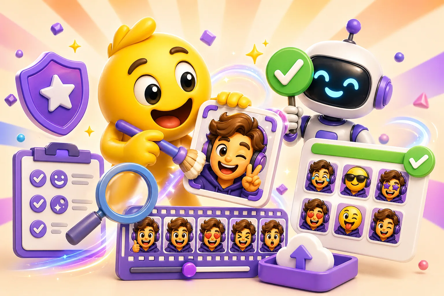
They're unreadable at 28px. Most people watch on mobile or small windows. Your emote shows up tiny in chat. If reviewers can't tell what it is at 28×28 pixels, instant rejection. Text is the worst offender—if you have letters, they need to be THICK and simple.
The animation flashes or moves too fast. Twitch has strict rules about seizure-inducing content. Rapid flashing, strobe effects, or anything that alternates colors faster than 3 times per second gets auto-rejected. Smooth, slow animations pass easily.
Copyright or trademark issues. Corporate logos, brand mascots, celebrity faces, sports team logos—all instant rejections. Even if you drew it yourself. Even if it's "parody." Twitch doesn't want legal trouble, so they reject anything that could be trademarked.
NSFW or offensive content. This includes sexual content, drug references, hateful imagery, and yes, even mild innuendo depending on who reviews it. Keep it family-friendly if you want it approved.
How to make emotes that pass review
Test at 28px first. Don't design at 112px and hope it scales. Open your emote, zoom out until it's 28 pixels wide, and see if you can still identify it. If you squint and can't tell what it is, simplify. Remove small details, thicken lines, increase contrast.
Keep text huge or remove it entirely. If you must include text, use 2-3 letters MAX in a thick, bold font. "POG" can work. "POGGERS" is too many letters. "Let's Go" in cursive? Forget it. The text needs to be at least 50% of the total emote height to be readable.
Use bold outlines. A 2-3 pixel black or white outline around your entire design makes it visible on both light and dark backgrounds. This is critical. Test your emote on light mode AND dark mode. If it disappears on one, add an outline.
Slow down the animation. Aim for 1-2 second loops minimum. A gentle bounce, a slow wave, eyes that blink slowly—these all work. Rapid shaking, color flashing, or anything "hyper" will get flagged. When in doubt, slow it down more.
Avoid gradients and complex shading. At 28px, gradients turn into mud. Flat colors with hard edges look way better when scaled down. If you need depth, use a simple 2-tone approach: light and shadow, no gradient between.
Technical requirements
- Three sizes required: 28×28px, 56×56px, and 112×112px. Upload all three when submitting.
- PNG format only (static emotes) or GIF (animated). Animated emotes are Twitch Partner only.
- Max file size: 1MB total for all three sizes combined. Animated GIFs count against this, so keep frame count reasonable (20-30 frames max).
- Transparent background. No white backgrounds or solid colors. Export with alpha transparency.
- Square aspect ratio. 1:1 only. Tall or wide emotes get squished.
Testing before submission
Before submitting to Twitch, upload your emote to a private Discord server first. Discord displays emotes at similar sizes. Send it in chat, react with it, see if you can identify it when scrolling fast. Show it to someone else without context and ask "what is this?" If they can't tell, it needs work.
Check your emote on both light and dark mode. Twitch chat backgrounds vary. An emote with a thin white outline looks great on dark mode and completely disappears on light mode. Add a contrasting outline or adjust colors.
If your emote is animated, watch it loop 10 times. Does it get annoying? Is the motion smooth? Are there any jarring frame transitions? Twitch reviewers watch these loop repeatedly. Make it pleasant to watch.
Common mistakes that cause rejections
- Uploading only the 112px version (you need all three sizes)
- Using a white or colored background instead of transparency
- Copying existing popular emotes (yes, even if you redrew them)
- Text that's readable at 112px but turns into blurry pixels at 28px
- Emotes that reference specific people, brands, or copyrighted characters
- Animation that strobes or flashes rapidly
- Details so fine they disappear when scaled down
What to do if you get rejected
Twitch usually gives a rejection reason, but it's often vague. "Does not meet guidelines" could mean anything. Look at the checklist above and identify the most likely culprit. Common fixes: add a thicker outline, slow down the animation, remove small details, increase text size, or simplify the color palette. Make one major change at a time so you know what worked.
Quick workflow: Design at 112px with thick outlines and simple shapes. Test by scaling to 28px. Slow your animation to 1-2 second loops. Export all three sizes (28, 56, 112) as transparent PNGs or GIFs. Upload to Discord first to test. If it looks good there and follows Twitch's content rules, submit. Start making your emote →
