That beautiful gradient you spent an hour perfecting looks like mud at 32×32 pixels. The subtle pastel palette that works in your illustration disappears completely when your emoji is displayed in Discord chat. Color choices that work at large sizes fail spectacularly when emojis shrink to the size of text. Here's how to pick colors that actually survive the scale-down.
High contrast is non-negotiable
At emoji size, low-contrast elements blend together into an indistinguishable blob. That pale yellow highlight on light skin? Gone. The dark blue shading on a black object? Invisible. You need strong value contrast—the difference between light and dark—for any detail to remain visible. Test this by converting your emoji to grayscale. If elements merge together in grayscale, they'll merge at small size even in color.
A simple rule: if two colors touch, they should be at least 3-4 shades apart in brightness. Light blue next to white doesn't work. Light blue next to dark blue does. Bright yellow on white doesn't work. Bright yellow on black does. When in doubt, push your contrast further than feels natural at large size—it'll look correct when shrunk.
This is why most successful emojis use bold, saturated colors with clear outlines or dark borders. The outline creates automatic contrast against any background. Even if your emoji is a pastel aesthetic, add a darker stroke around the edges so it doesn't vanish against light backgrounds in Discord or Slack.
Saturated colors read better than muted ones
Muted, desaturated colors—the kind you'd use in sophisticated branding or mature artwork—lose all their subtlety at emoji size. That beautiful dusty rose becomes gray. The sage green looks like brown. Saturated, vibrant colors maintain their identity when reduced. A true red stays red. A bright cyan stays cyan. A fully saturated yellow still reads as yellow.
This doesn't mean every emoji needs to be eye-searing neon, but it does mean you should push saturation higher than you would for illustration work. That "60% saturated" color that looks refined at poster size? Try 85-100% saturation for the emoji version. It'll feel garish while you're designing it, but it'll look normal at display size.
The exception is if you're intentionally making a monochrome or grayscale emoji. In that case, lean into it fully—make it obviously black and white or single-color, not accidentally desaturated.
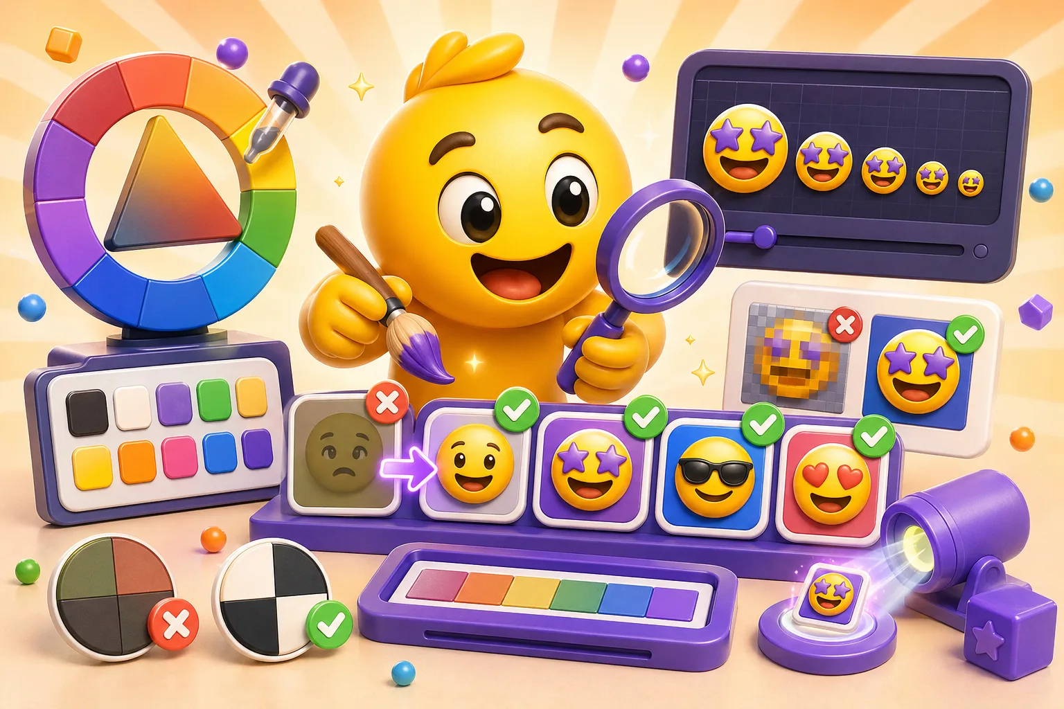
Limit your palette to 4-6 main colors
Too many colors at emoji size creates visual noise. Your eye can't process ten different hues when the whole image is smaller than your fingernail. Successful emojis typically use 3-4 main colors plus black/ white for outlines and highlights. This creates clarity and makes the emoji instantly readable.
Think about the standard emoji set—each one has a limited, intentional palette. The laughing-crying emoji is yellow face, black outlines, blue tears, white teeth. Four colors. The heart emoji is just red with maybe a highlight. Fire is red/orange/yellow. None of them use twelve colors because that would be chaos.
When choosing your limited palette, pick colors that are clearly distinct from each other. Don't use three different shades of blue that will blend together. Use blue, yellow, and red—colors that are obviously different. Within each color, you can have one lighter and one darker version for shading, but keep the base hues clearly separated.
The background color problem
Your emoji will appear on Discord's dark mode (almost black), Discord's light mode (white), Slack's white interface, and potentially other platforms with different background colors. This means you can't rely on the background to provide contrast. A white emoji looks great on dark mode and vanishes on light mode. A black emoji has the opposite problem.
The solution is to add a contrasting outline or stroke to your emoji. If your emoji has light elements, add a dark outline (usually black or dark gray). If your emoji has dark elements, add a light outline (white or very light gray). This creates separation from any background. The outline doesn't need to be thick—1-2 pixels at working size is enough.
Test your emoji on both dark and light backgrounds before finalizing. In your design software, literally place your emoji on a black rectangle and a white rectangle and look at them at display size. If anything disappears or loses definition on either background, adjust the colors or add outlines.
Avoid color combinations that vibrate
Certain color combinations create optical vibration or look unstable when placed next to each other, especially at small sizes. Pure red next to pure green is the classic example—they're exactly opposite on the color wheel at full saturation, and your eye can't quite focus on the boundary. Same with pure blue and pure orange, or pure yellow and pure purple.
This doesn't mean you can't use complementary colors together, just don't use them at full saturation directly adjacent to each other. Put a neutral color (black, white, gray) between them as a buffer. Or adjust one color to be lighter/darker than the other, which breaks the vibration effect. Red and green work fine if the red is darker and the green is lighter, or vice versa.
Another problematic combination: bright yellow on white, or any very light color on white. There's not enough contrast, and the emoji will be barely visible. If you need yellow in your emoji, make sure it's a rich, deep yellow—more gold than lemon—or outline it in a darker color.
Colorblind accessibility matters
About 8% of men and 0.5% of women have some form of colorblindness, most commonly red-green colorblindness. If your emoji's meaning depends on distinguishing red from green, a significant portion of your audience won't be able to read it. This particularly matters for status indicators, progress markers, or any emoji where color conveys information.
The fix is to not rely solely on color to convey meaning. If you need a "success" emoji and a "failure" emoji, don't just make one green and one red—also give them different shapes or symbols. A green checkmark and a red X work because the shape difference is obvious even if you can't see the colors. A green circle and a red circle don't work because colorblind users just see two circles.
Test your emojis with a colorblindness simulator (many are available free online). View your emoji through deuteranopia (red-green blindness) and protanopia filters. If important elements become indistinguishable, adjust your colors or add shape differentiation.
Shading and gradients at small scale
Complex gradients with multiple color stops look muddy at emoji size. That four-color sunset gradient compresses into a vague blob of orange- ish. If you want shading, use simple two-tone shading—a light side and a dark side, not gradual transitions. Cell shading (flat color areas with hard shadows) works better than gradual shading.
For a sphere or rounded object, instead of a smooth gradient from light to dark, use three flat zones: bright highlight, base color, dark shadow. This maintains the 3D effect while staying crisp at small size. Think about how classic cartoon art handles shading—flat color zones, not photorealistic gradients.
If you're going for a flat design aesthetic (which works great for emojis), skip shading entirely. Use solid colors with outlines. Flat design is popular in emoji design specifically because it scales down so well. No detail is lost because there's no detail to lose—just bold, clear shapes.
Color consistency across your emoji set
If you're making multiple emojis for the same channel or campaign, use a consistent color palette across all of them. This creates visual cohesion and makes your emoji set feel intentional rather than random. Pick your 4-6 colors, save them as swatches, and use those exact colors across every emoji you make.
For example, if you use a specific shade of blue in one emoji, use that exact same blue in other emojis where blue appears. Don't use slightly different blues in each emoji—it looks unintentional and amateur. This also helps with branding if you're making emojis for a server or organization. Use colors from the brand palette to reinforce identity.
Exception: if you're making emojis that represent different characters, teams, or categories, then intentional color differentiation makes sense. Team Red uses red tones, Team Blue uses blue tones. But within each category, stay consistent.
Testing your colors at actual size
You cannot judge emoji colors at working size. Period. You're designing at 512×512 or 1024×1024 pixels, but people will see it at 32×32 or maybe 128×128 maximum. Zoom out constantly while designing. In Photoshop or your design tool, keep a window open at 100% view showing your emoji at actual display size.
Export a test version and actually upload it to Discord or Slack before you make twenty more emojis in the same palette. Look at it in chat at the size people will actually see. Do the colors still work? Can you tell what the emoji is? Are details visible? If not, adjust before continuing.
The brutal truth: many color choices that look sophisticated and refined at large size look washed out or muddy at emoji size. You have to be willing to make things brighter, more saturated, and higher contrast than feels natural. Trust the small-size view more than the working-size view.
Quick color selection checklist
Before finalizing your emoji colors, ask yourself:
- Do adjacent colors have enough contrast? (3-4 shades apart in brightness)
- Are my colors saturated enough to maintain identity at small size?
- Does my emoji work on both dark and light backgrounds?
- Have I limited my palette to 4-6 main colors plus black/white?
- Can colorblind users distinguish important elements without relying on color?
- Does my emoji look clear at 32×32 pixels, not just at working size?
If the answer to any of these is no, adjust before moving forward. Color problems only get worse as you scale down, they never get better.
Color theory for emojis boils down to this: high contrast, saturated colors, limited palette, and constant testing at actual size. Your beautiful subtle palette might need to become bold and obvious, and that's correct for the medium. Create emojis with optimal color choices here →
